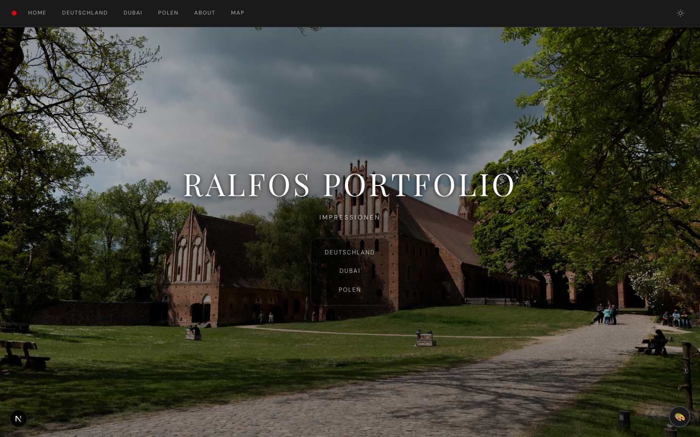
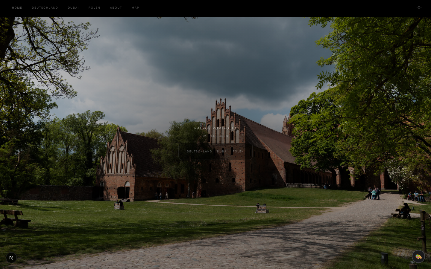
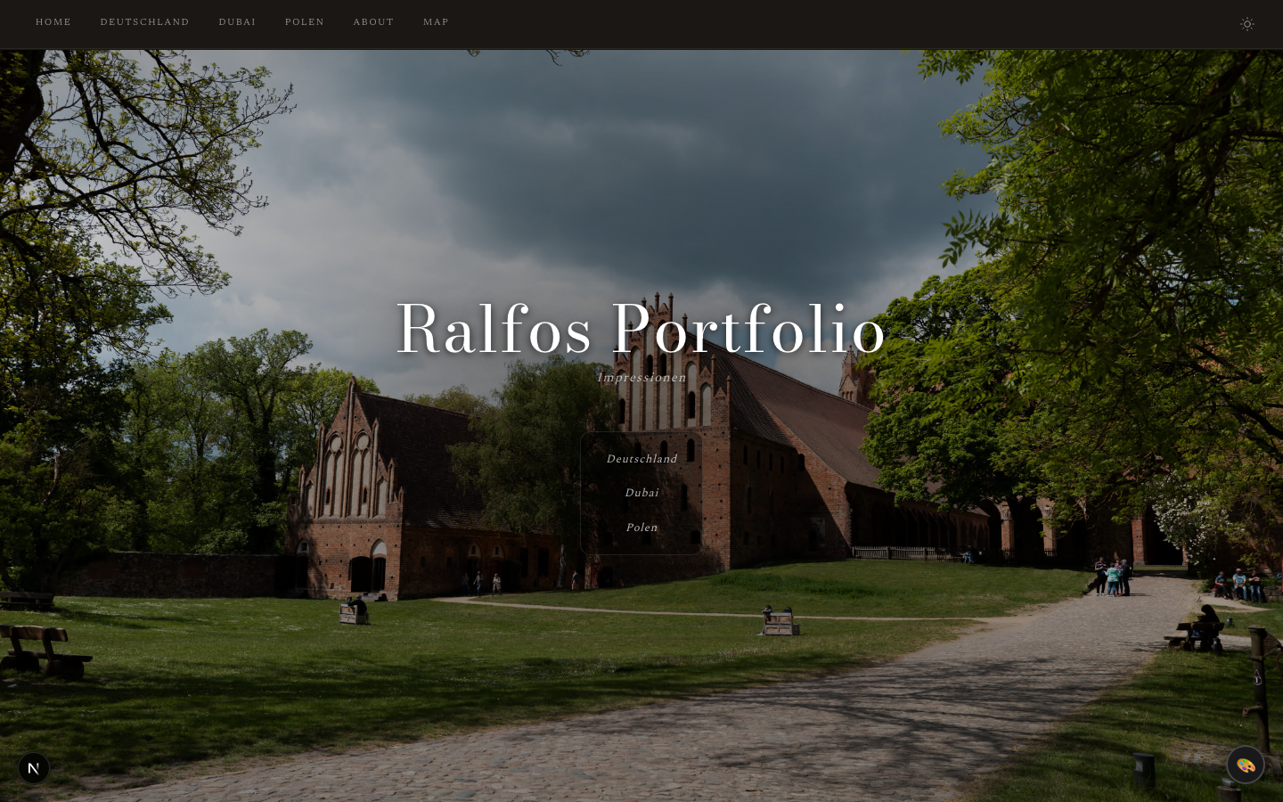
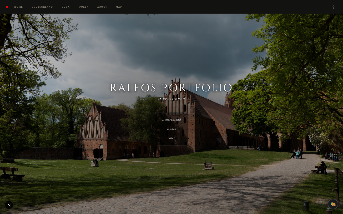
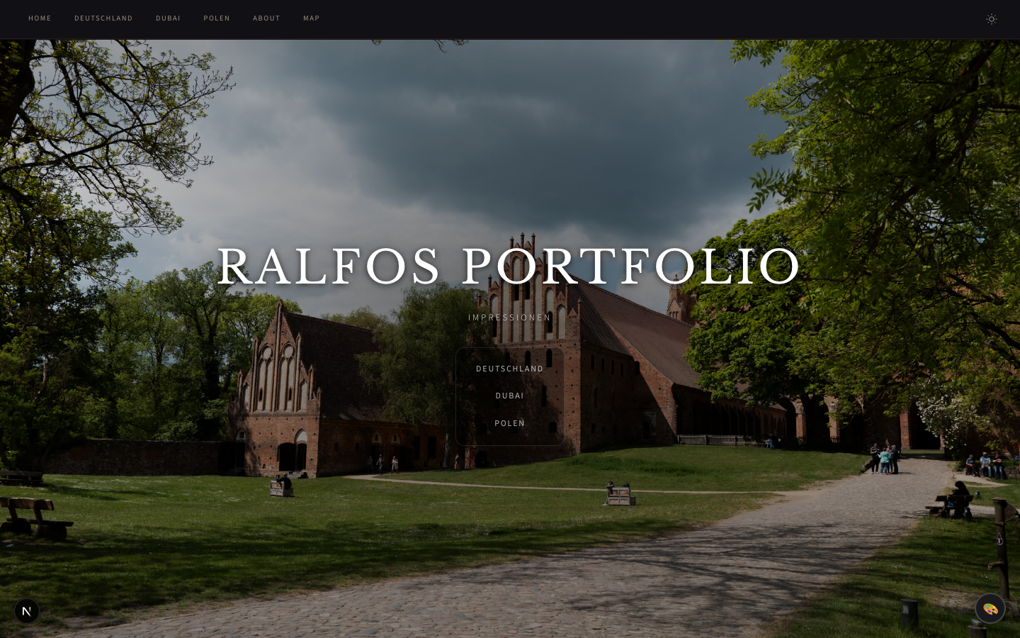
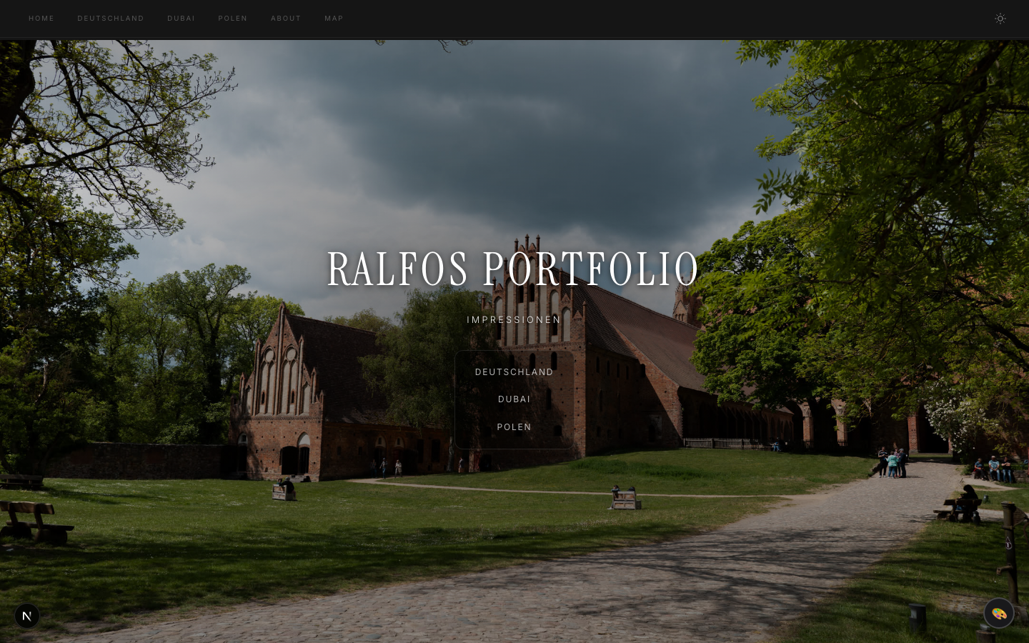
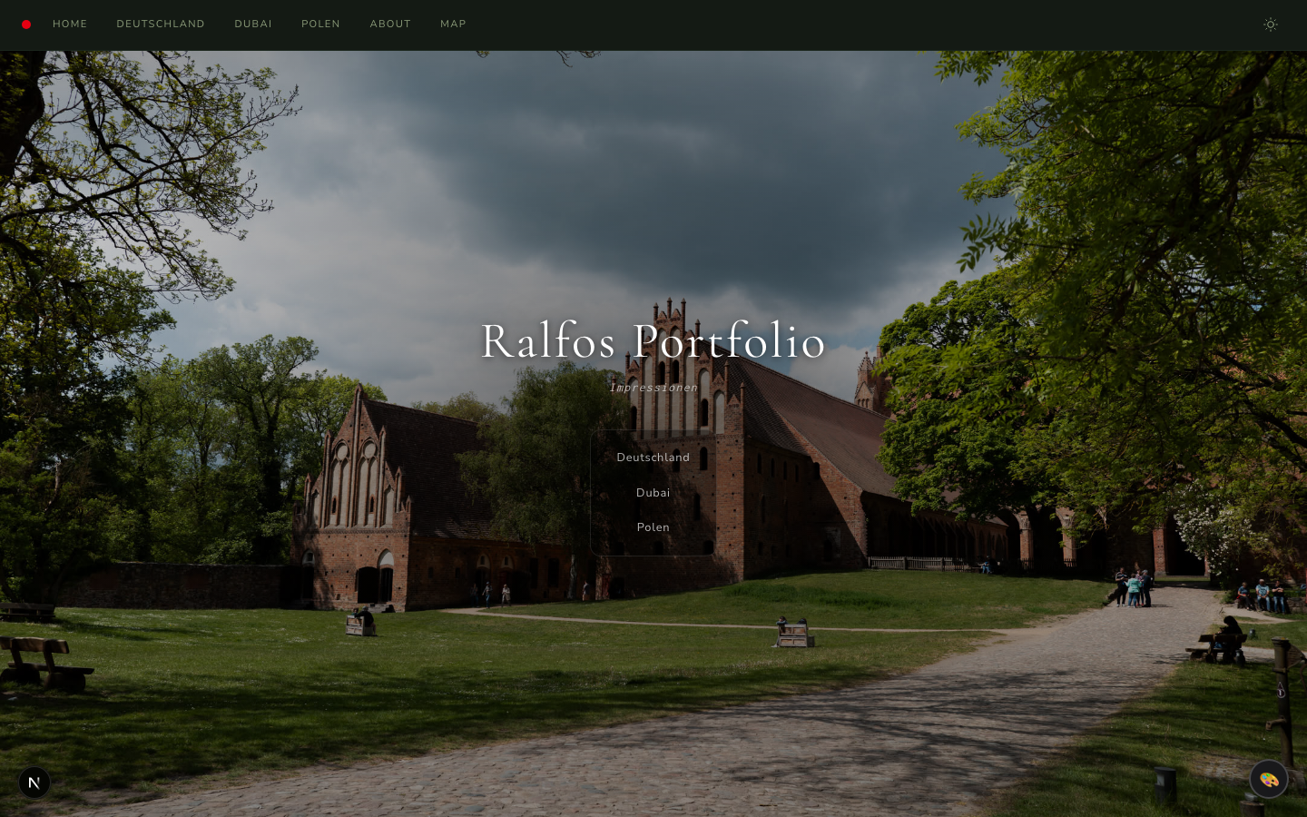
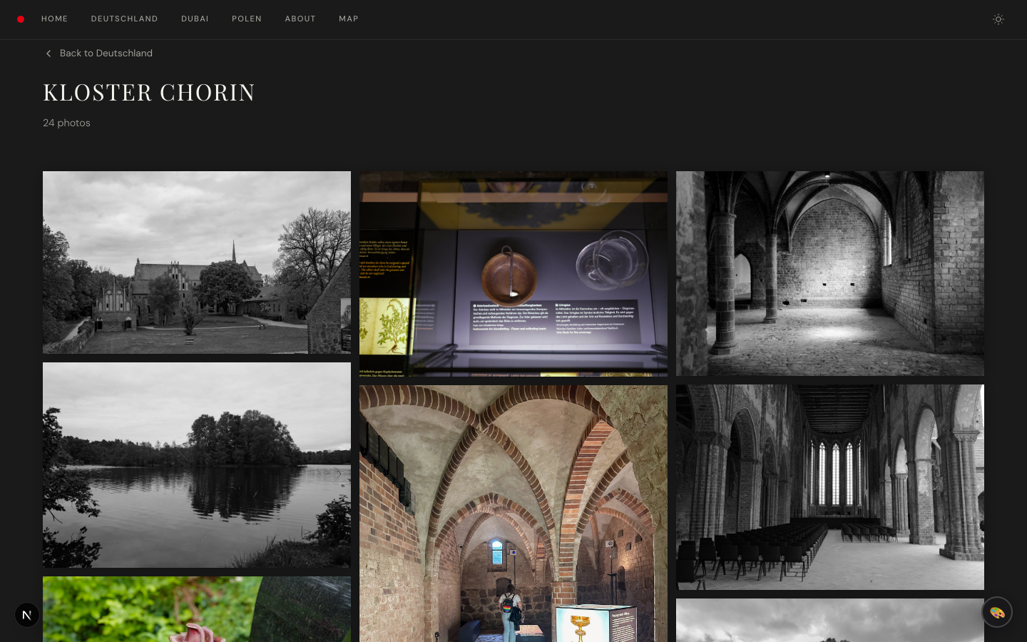
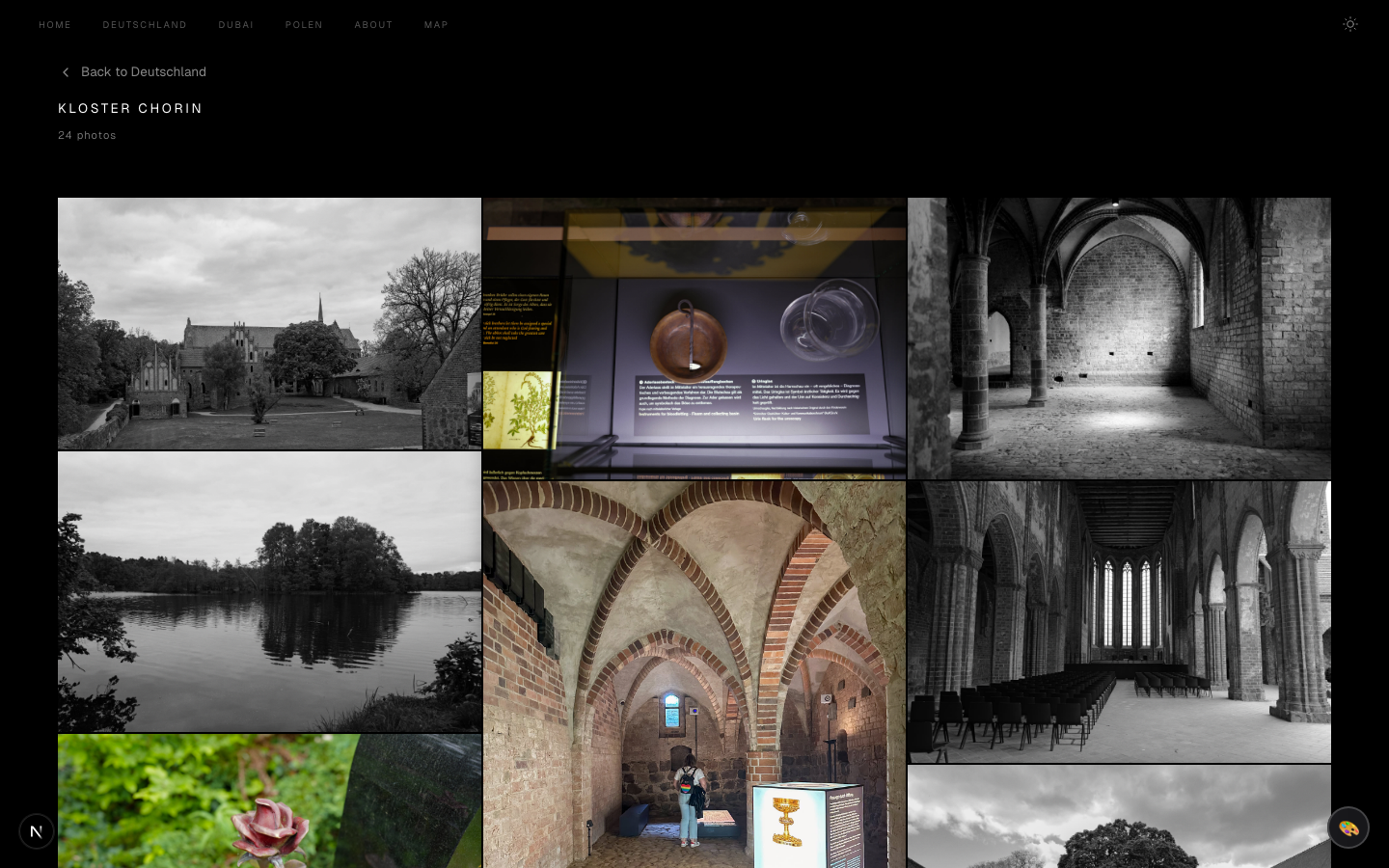
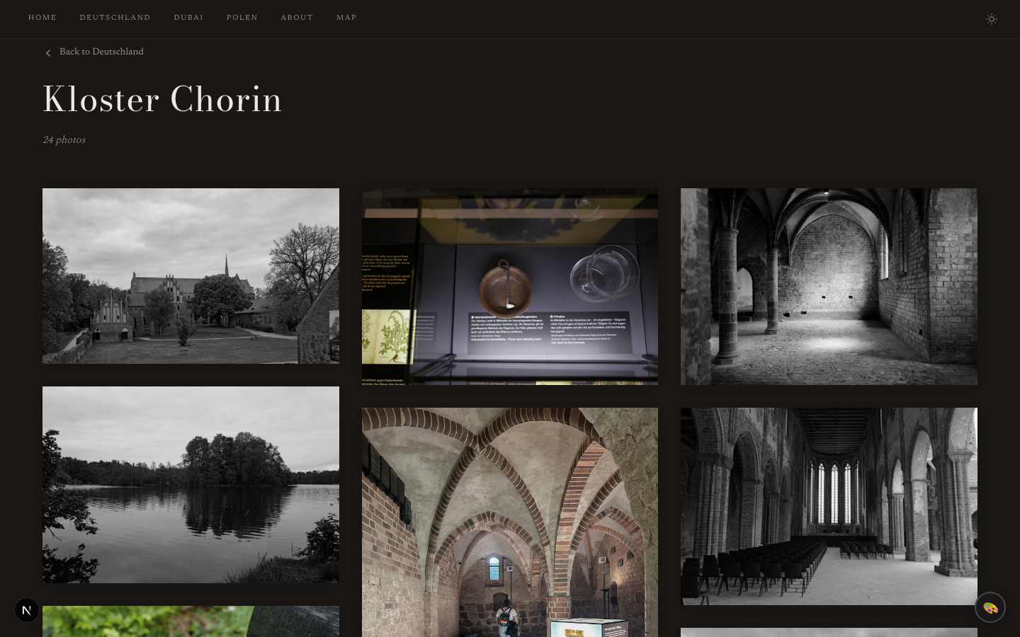
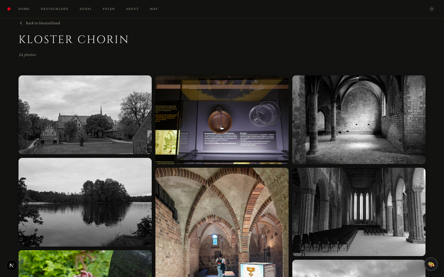
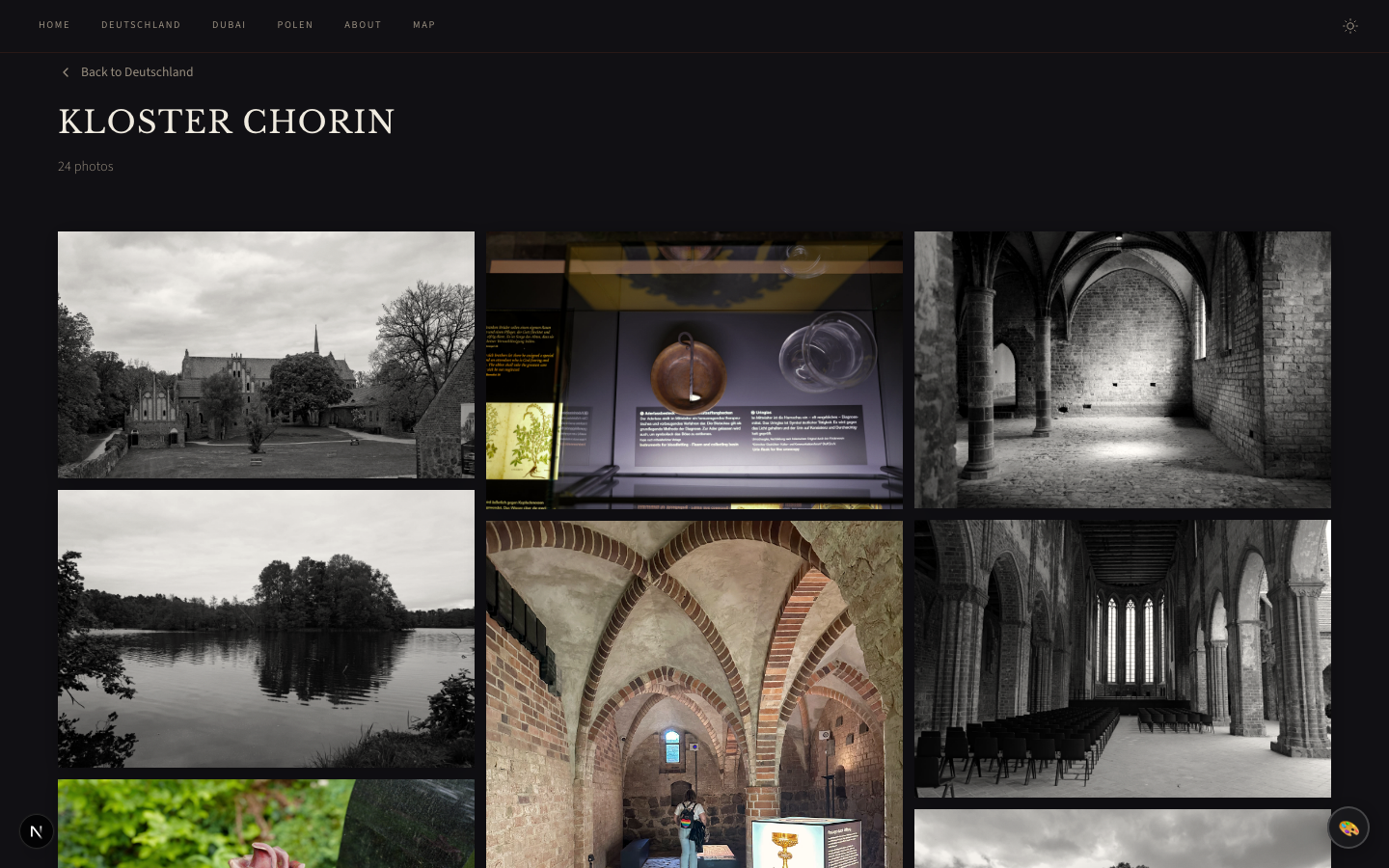
# Theming Control the visual identity of your gallery from `content/gallery.yaml`. Choose a built-in preset or customize individual properties β€” no CSS editing required. ## Quick Start Add a single line to your `gallery.yaml`: ```yaml theme: minimal ``` That's it. Your entire gallery switches to the minimal theme. ## Built-in Presets | Preset | Style | Accent | Fonts | Hero | Frame | Grain | | ------------- | ------------------------------ | ------------ | ---------------------------------- | ----------- | ------------ | ----- | | **studio** | Leica-inspired, editorial | πŸ”΄ `#e60012` | Playfair Display + DM Sans | Split | Passepartout | βœ“ | | **minimal** | Swiss brutalist, high contrast | ⚫ `#000000` | Geist + IBM Plex Mono | Fullbleed | None | βœ— | | **editorial** | Cinematic magazine, warm tones | 🟀 `#8B2500` | Bodoni Moda + Newsreader | Split | Shadow | βœ— | | **classic** | Gilded gallery, warm luxury | 🟑 `#c49a3c` | Cinzel + Crimson Pro | Minimal | Passepartout | βœ— | | **noir** | Darkroom analog, film noir | 🟠 `#ff6b35` | Libre Baskerville + Source Sans 3 | Fullbleed | Passepartout | βœ“ | | **monograph** | Typographic, book-like | ⬛ `#333333` | Instrument Serif + Inter | Typographic | None | βœ— | | **botanica** | Organic, nature-inspired | 🟒 `#4a7c59` | Cormorant Garamond + Nunito Sans | Split | None | βœ— | Default is `studio` if no theme is specified.
Studio
Leica-inspired, red dot
Minimal
Swiss brutalist, fullbleed hero
Studio theme Minimal theme
Editorial
Cinematic magazine, warm charcoal
Classic
Gilded gallery, gold accents
Editorial theme Classic theme
Noir
Darkroom analog, film noir
Monograph
Typographic, book-like
Noir theme Monograph theme
Botanica
Organic, nature-inspired
Botanica theme
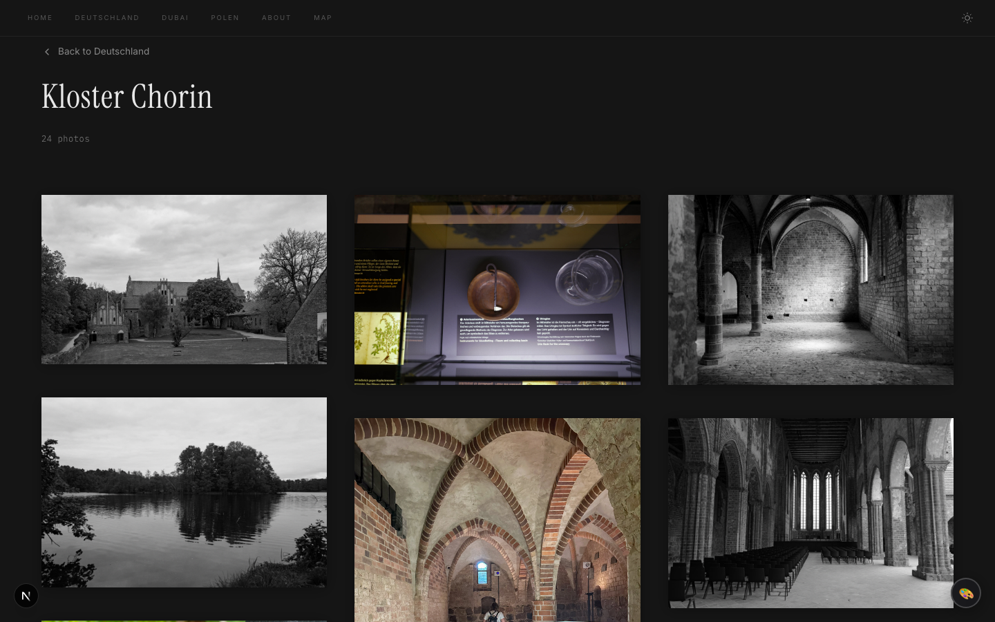
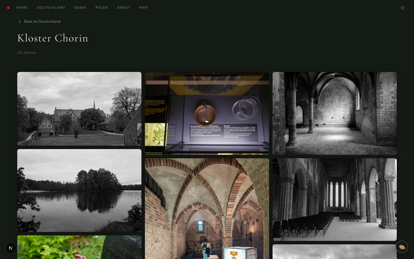
### Grid View Examples
Studio Minimal
Studio grid Minimal grid
Editorial Classic
Editorial grid Classic grid
Noir Monograph
Noir grid Monograph grid
Botanica
Botanica grid
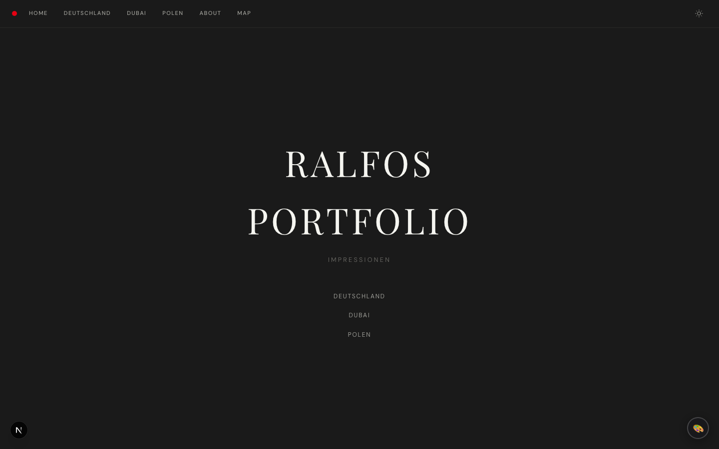
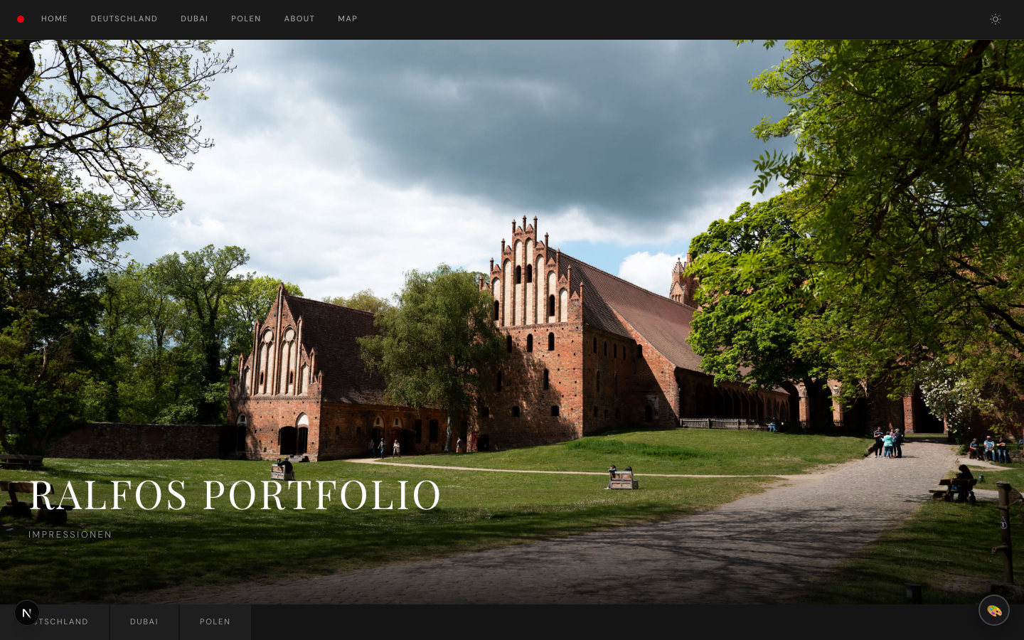
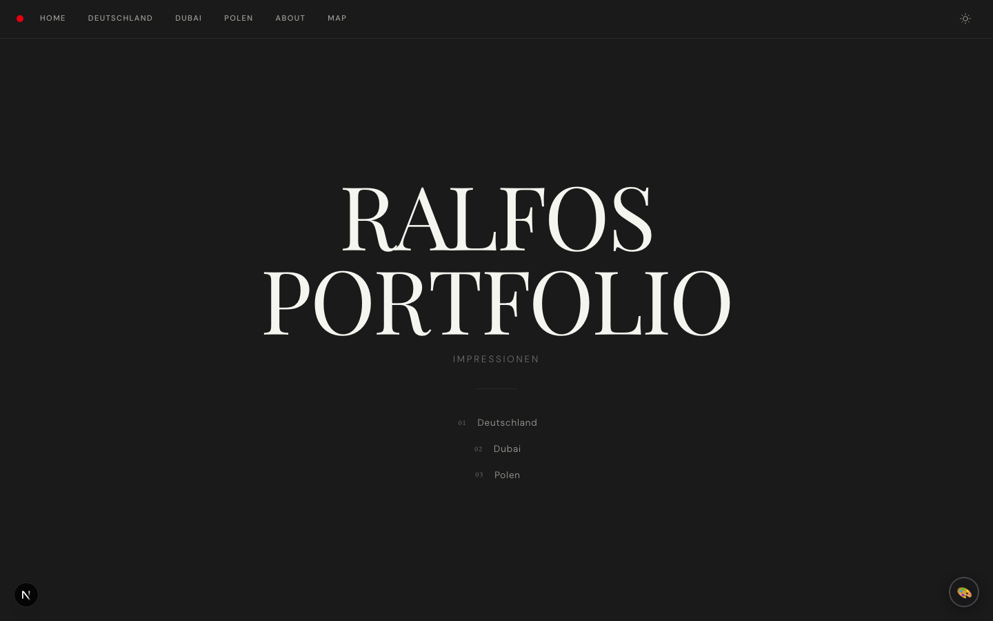
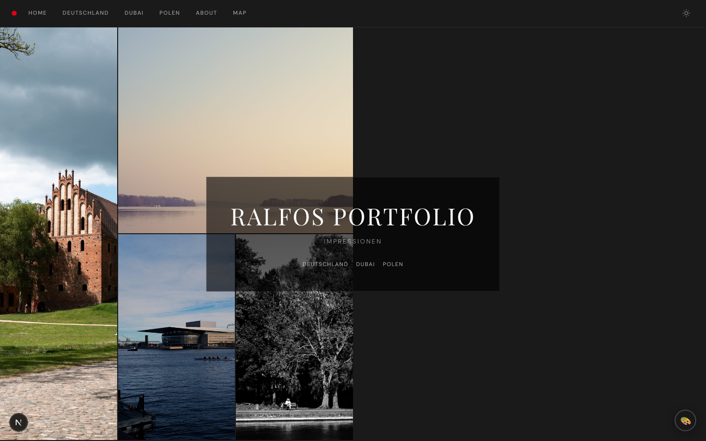
### What makes each theme unique **Studio** (default) β€” Leica-inspired with a red nav dot, passepartout photo frames, film grain, and a split hero layout. Clean editorial feel with Playfair Display headings. **Minimal** β€” Swiss Brutalist aesthetic inspired by MΓΌller-Brockmann and Dieter Rams. Fullbleed hero image, true black/white palette, zero-gap photo grid with no hover effects, ultra-tiny navigation text. Every pixel earns its place. **Editorial** β€” Cinematic magazine feel inspired by Aperture and Magnum Photos. Oversized Bodoni Moda serif titles, warm charcoal backgrounds, generous grid spacing, slow cinematic transitions with desaturation-on-idle photos, and pull-quote section labels. **Classic** β€” Fine art gallery aesthetic with warm gold accents, Cinzel Roman capitals for headings, decorative ornamental dividers, warm passepartout frames, rounded corners, and an elegant gold header dot. Feels like a luxury exhibition catalog. **Noir** β€” Darkroom analog aesthetic with warm amber accents on a deep cool-black base. Sepia-tinted photos with vignette hover effects, film-edge EXIF labels in monospace, and a grain overlay. Inspired by wet-plate photography and film noir cinematography. **Monograph** β€” Type-first book design with no hero image. Features an 8rem serif title, numbered photo indices via CSS counters, slide-up EXIF captions, hairline dividers, and generous whitespace. Feels like an artist monograph. **Botanica** β€” Organic, nature-inspired with forest green accents and warm linen backgrounds. Rounded corners, botanical ornament dividers (❧), italic captions, and gentle hover animations. Feels like a botanical field guide. ## Custom Theme Start from any preset and override individual properties: ```yaml theme: preset: studio # base preset to extend (default: studio) accent: '#2563eb' # brand/accent color (any hex) fonts: heading: 'Inter' # Google Fonts name for headings body: 'Inter' # body text caption: 'JetBrains Mono' # EXIF captions radius: 8 # border-radius in px (0 = sharp corners) photoFrame: none # "none" | "passepartout" | "shadow" grain: false # film grain overlay on photos headerDot: false # accent-colored dot in the nav bar heroStyle: split # "split" | "fullbleed" | "minimal" | "stacked" | "typographic" | "mosaic" ``` All properties are optional β€” omitted values fall back to the preset defaults. ## Properties Reference ### `accent` The brand color used for hover effects, navigation highlights, the header dot, and OG social preview images. ### `fonts` Google Fonts names. Fonts are loaded automatically β€” just use the name as it appears on [fonts.google.com](https://fonts.google.com). Three font slots: - **heading** β€” album titles, hero title, section labels - **body** β€” navigation, descriptions, UI text - **caption** β€” EXIF metadata, photo captions ### `radius` Border radius in pixels applied to photo grid items and album cards: - `0` β€” sharp, editorial corners - `4-8` β€” subtle rounding - `12+` β€” soft, modern feel ### `photoFrame` How photos are framed in the grid: - **`none`** β€” photos fill the grid cell directly - **`passepartout`** β€” museum-style mat border around each photo with print-style EXIF captions below - **`shadow`** β€” subtle drop shadow behind each photo ### `grain` When `true`, a subtle film grain texture overlays each photo in the grid. Adds an analog, filmic character. ### `headerDot` When `true`, shows a small accent-colored dot in the navigation bar (inspired by the Leica red dot). ### `heroStyle` Controls the homepage hero layout: - **`split`** β€” title/nav on the left, hero image on the right (used by Studio, Editorial, Botanica) - **`fullbleed`** β€” hero image fills the entire viewport, title overlaid in the corner (used by Minimal, Noir) - **`minimal`** β€” centered title card with decorative ornament, hero image as a banner below (used by Classic) - **`stacked`** β€” full-viewport hero image with title gradient-overlaid at the bottom, horizontal thumbnail navigation strip below - **`typographic`** β€” no hero image; massive centered title with numbered album navigation list (used by Monograph) - **`mosaic`** β€” asymmetric multi-image grid with frosted-glass title overlay centered on top
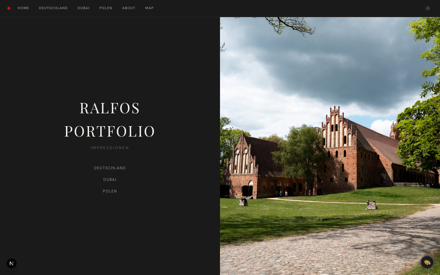
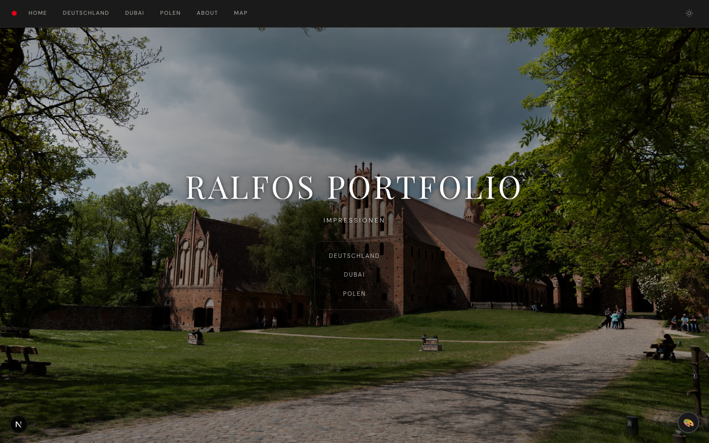
Split Fullbleed Minimal
Split Hero Fullbleed Hero Minimal Hero
Stacked Typographic Mosaic
Stacked Hero Typographic Hero Mosaic Hero
### `grid.layout` Controls the photo grid layout on album pages: - **`masonry`** β€” Pinterest-style stacked columns, images shown at natural aspect ratios (default) - **`uniform`** β€” CSS Grid with fixed aspect ratio cells - **`showcase`** β€” first image displayed at full width (16:9), rest in standard grid - **`filmstrip`** β€” horizontal scroll of tall vertical image strips with scroll snapping - **`editorial-flow`** β€” alternating full-width (21:9) and side-by-side (4:3) image pairs ## Examples ### Minimal portfolio ```yaml theme: preset: minimal accent: '#0066cc' fonts: heading: 'Outfit' body: 'Outfit' ``` ### Film photography blog ```yaml theme: preset: studio accent: '#d4a017' grain: true photoFrame: passepartout ``` ### Modern magazine ```yaml theme: preset: editorial radius: 12 fonts: heading: 'Fraunces' body: 'Inter' caption: 'IBM Plex Mono' ``` ### Luxury gallery ```yaml theme: preset: classic accent: '#b8860b' fonts: heading: 'Playfair Display' body: 'Lora' ``` ### Dark analog portfolio ```yaml theme: preset: noir heroStyle: stacked ``` ### Type-forward monograph ```yaml theme: preset: monograph accent: '#444' fonts: heading: 'DM Serif Text' ``` ### Nature / travel journal ```yaml theme: preset: botanica heroStyle: mosaic grid: layout: editorial-flow ```